At Zip, we’re on a mission to become the first payment choice, everywhere and every day. We believe that by putting the needs and interests of our customers and partners at the centre of everything we do, we can create a better world. Here you will find the building blocks for the Zip brand.
We’re excited to build a more fearless world, together.
Introducing the Zip logo
-

Full Colour Light
-

Full Colour Dark
-

Monochrome
Using the Zip logo
The biggest, little logo
We establish logo clear space across all communications to ensure our logo has the breathing room it needs. The Zip checkout button has the measurement for clear space.
Minimum sizes of our logo are defined by merchants who use our product.
The best of the buttons
This is our current range of checkout buttons. Depending on merchant requirements, we have a variety of styles to choose from to make sure Zip remains legible at small sizes and stands out amongst the crowd at checkout.
What not to do with the logo
1. Do not stretch the logo.
2. Do not rotate the logo.
3. Only use designated colours and colour combinations.
4. Do not skew the logo.
5. Do not unevenly extend the pocket.
6. Do not break the -7 degree angle.
7. Do not place text inside the logo without approval
8. Do not add effects or shadows to the logo.
Zip Brand Colours
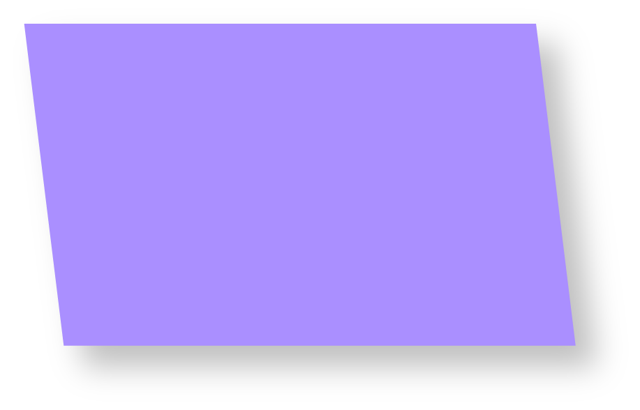
-

Fearless
HEX: #AA8FFF
R 170 G 143 B 255
PMS: 2655
CMYK: 54,59,0,0
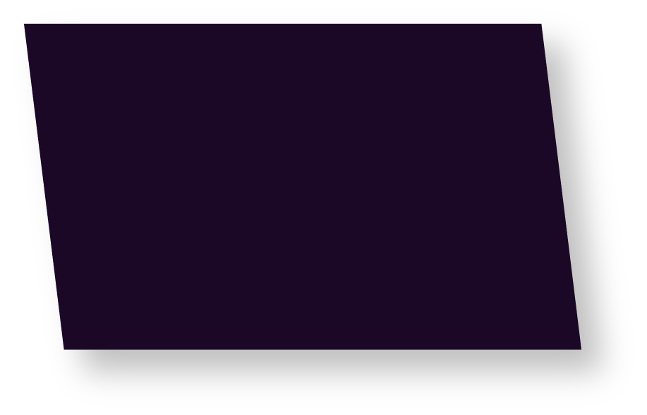
-

Confidence
HEX #1A0826
R 26 G 8 B 38
PMS: 5255
CMYK: 97, 100, 15, 62
-

Control
HEX #FFFFFA
R 255 G 255 B 250


